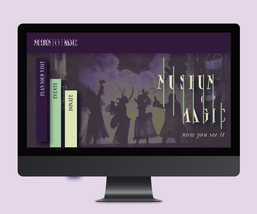
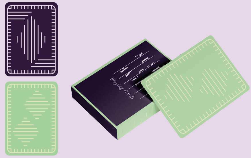
In this project, I was assigned a museum to design a brand identity for. In this identity I wanted to highlight the luxury, mystery, and playfulness of magic and illusion. The letterforms hide behind stripes that invoke curiosity and also serve as a graphic language for the system.
mUSEUM OF MAGIC — rEBRAND
AfterEffects
Illustrator
Photoshop


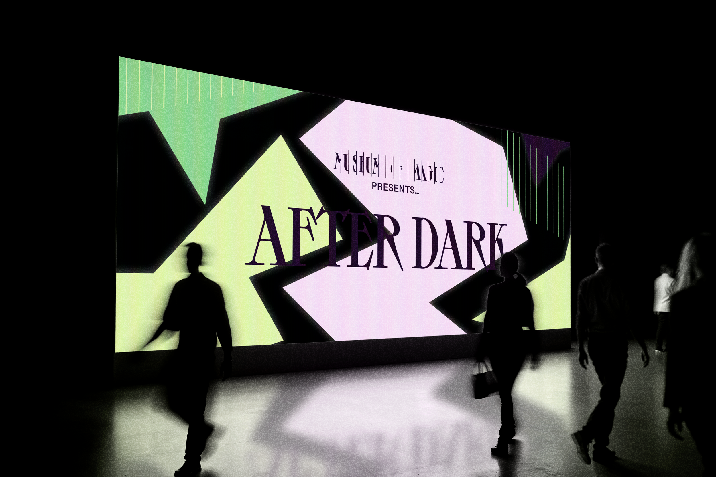
“aFTER DARK” EVENT MOCK-UPS
This is a spin-off identity for a museum-hosted event that still relates to the original museum identity.


Here are some identity ideas I played with during my ideation stage that didn't quite make the cut and why.
pROCESS

This is the current system before it was fully fleshed out and with a different color palette. I really liked this idea of the lines hiding the type, and felt it played into the curious nature of the facade of magic and illusions. However, I received feedback to question the color palette and ended up moving towards the less scientific teal to a more luxurious purple and sage green palette.

During my logo ideation I sketched this letterhead logo that felt luxurious but also ominous. I enjoyed the idea of using this graphic symbol as negative space in die-cuts and embossing, like an “invisible” logo. The M also creates a spade shape in the negative space that I thought was clever in relation to the museum. Ultimately I didn't feel sold on it and though the quality of the patterning for the line idea worked better as a system.

I really enjoyed the illustrative quality of this system. I also thought the flexibility of the different curtains was a great start for an identity. But I ultimately felt the system wasn't as strong as my other options and decided to not continue with this idea.