ALTA FRECUENCIA — CAMPAIGN IDENTITY
This campaign celebrates Latin art, literature, and music—uplifting voices that feel especially vital today. Centered on joy and pride, it highlights Latin creativity through music and sound. Responding to backlash against Puerto Rican artist Bad Bunny headlining the Super Bowl, it turns outrage into celebration, honoring Latin music as a unifying cultural force. At its core, the campaign reclaims space and embraces identity through joy, affirming the beauty, strength, and influence of Latin culture amid division and erasure.
InDesign
Illustrator
AfterEffects
Photoshop
WATCH FULL CAMPAIGN TRAILER HERE:


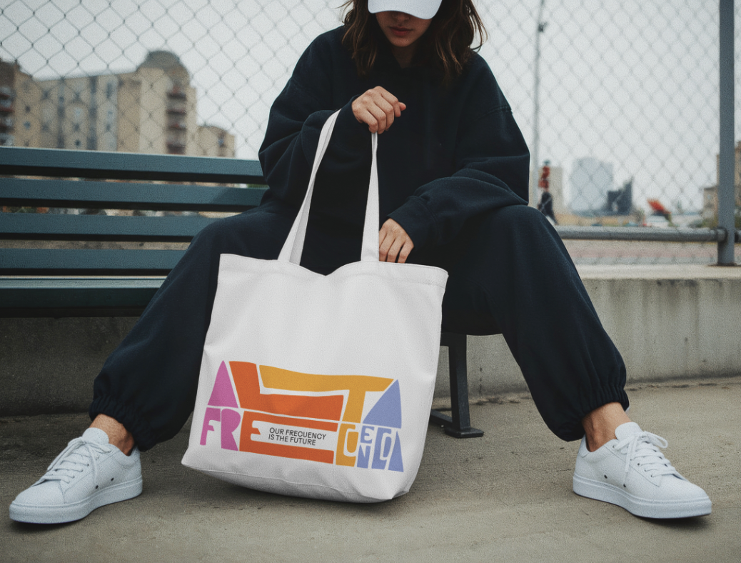
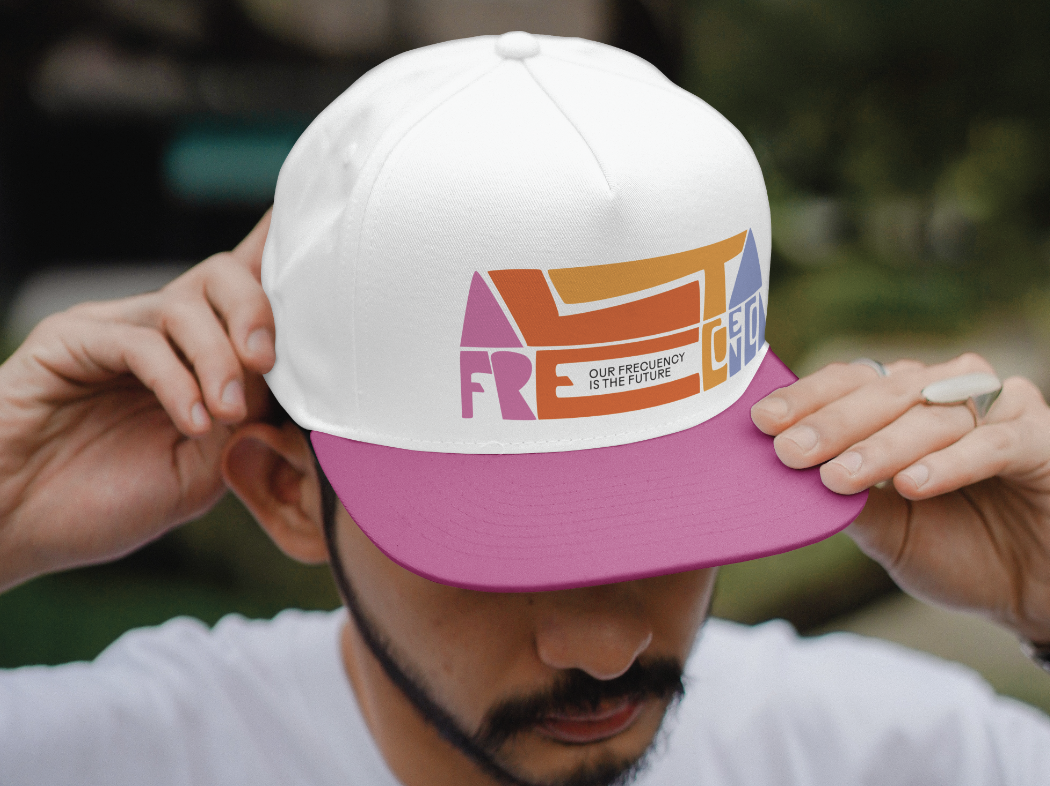
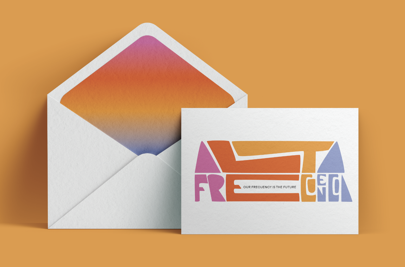
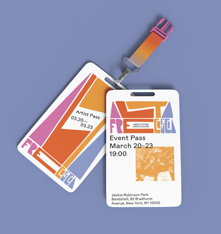
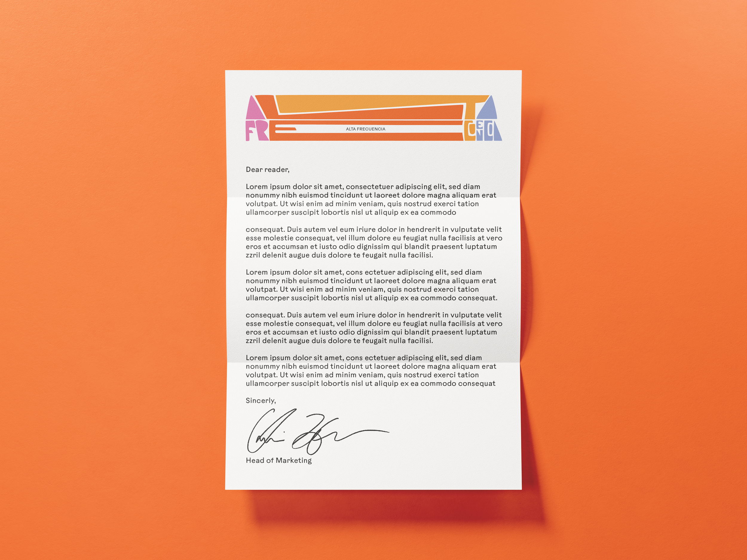
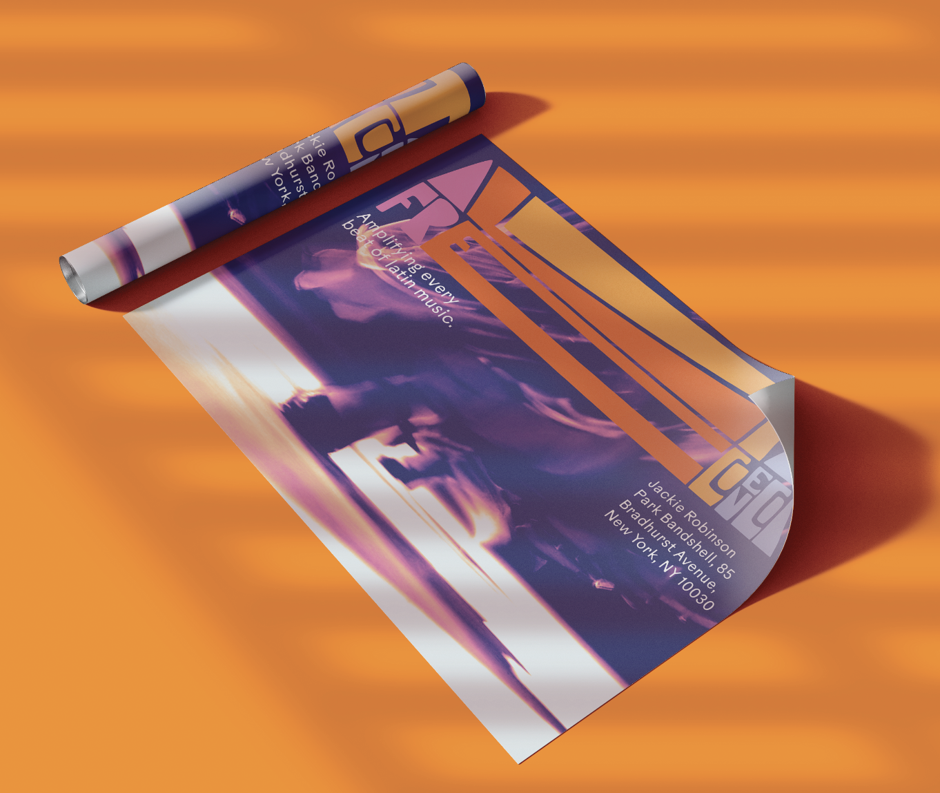

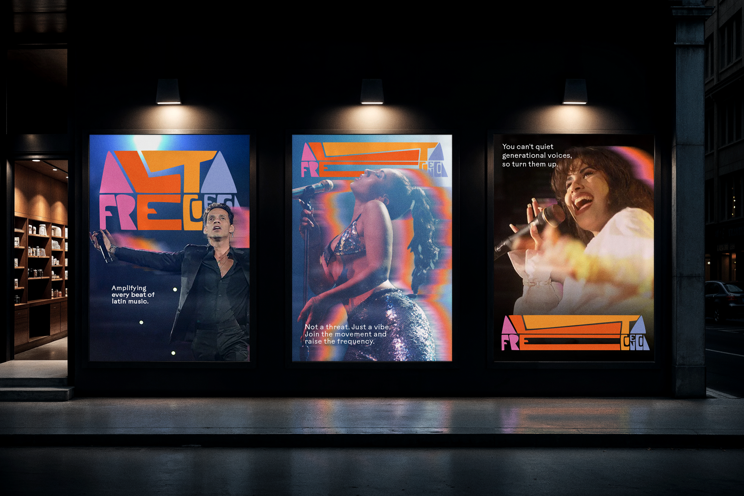
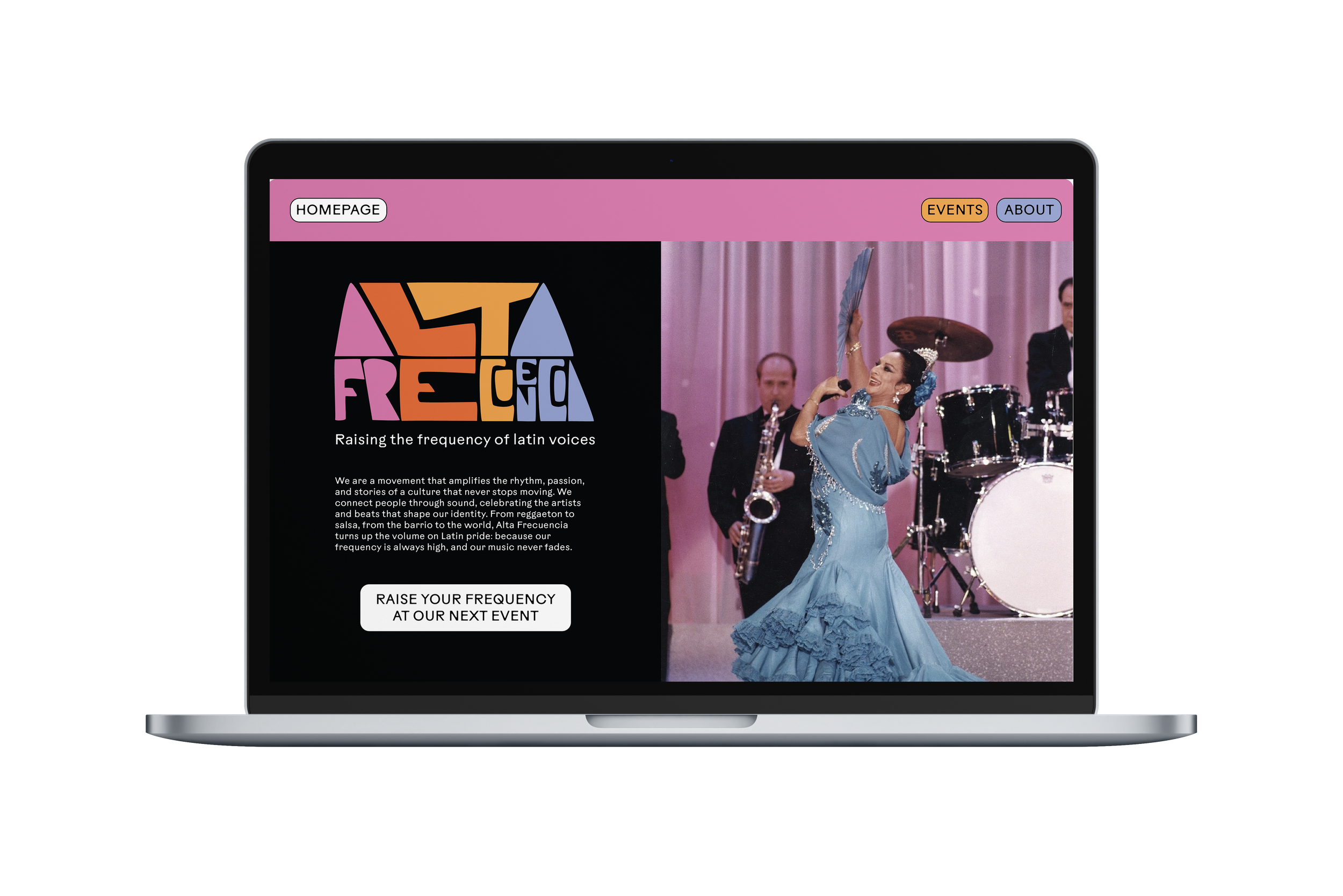
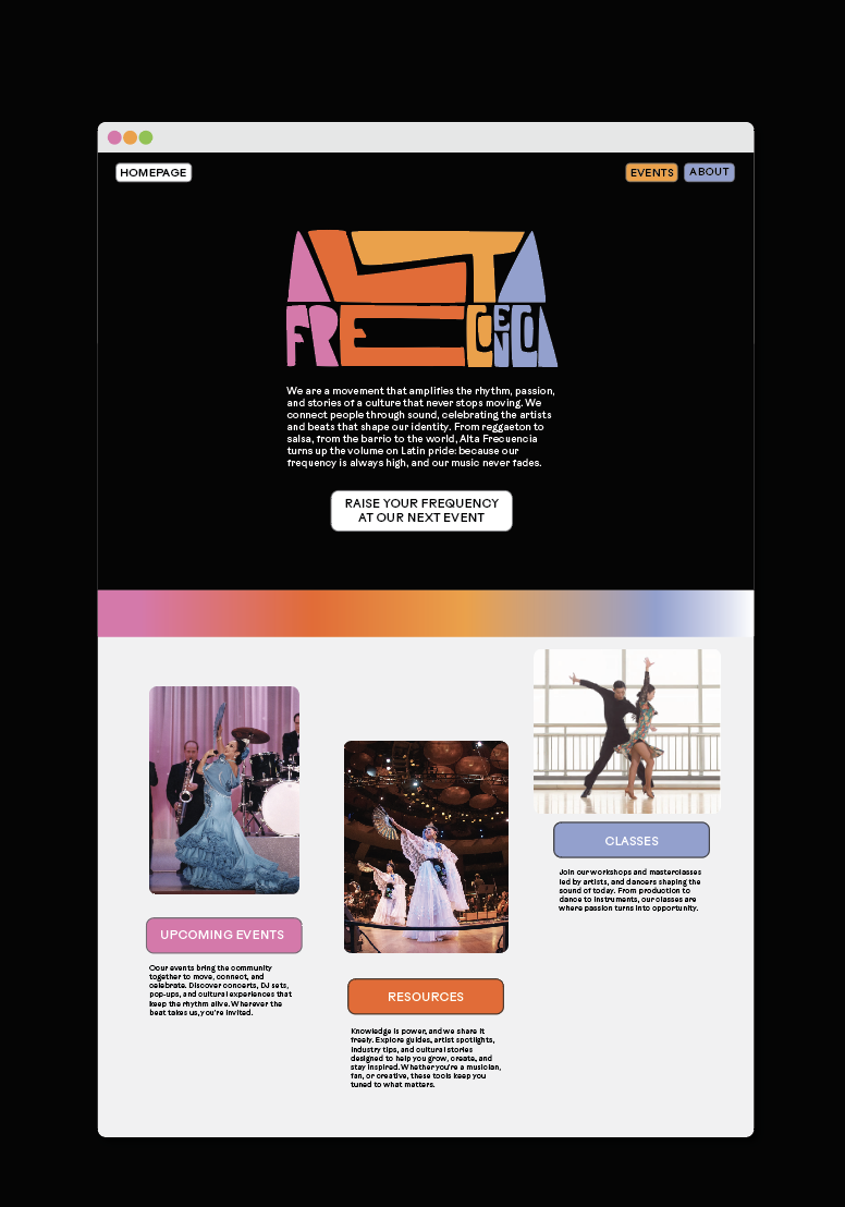
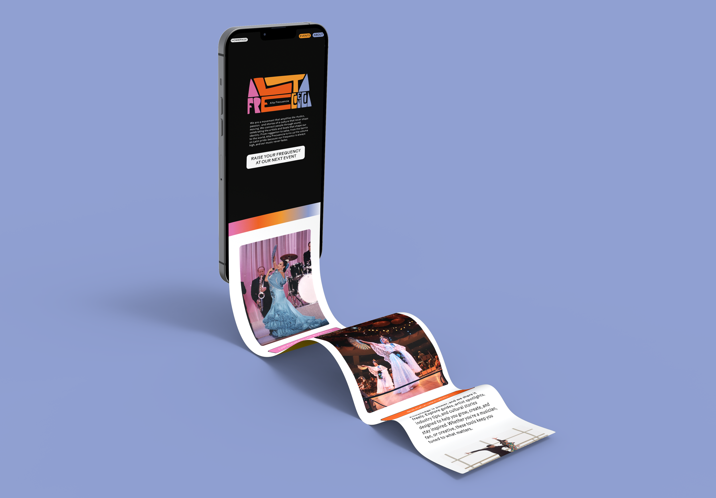

eNGAGEMENT DESIGN
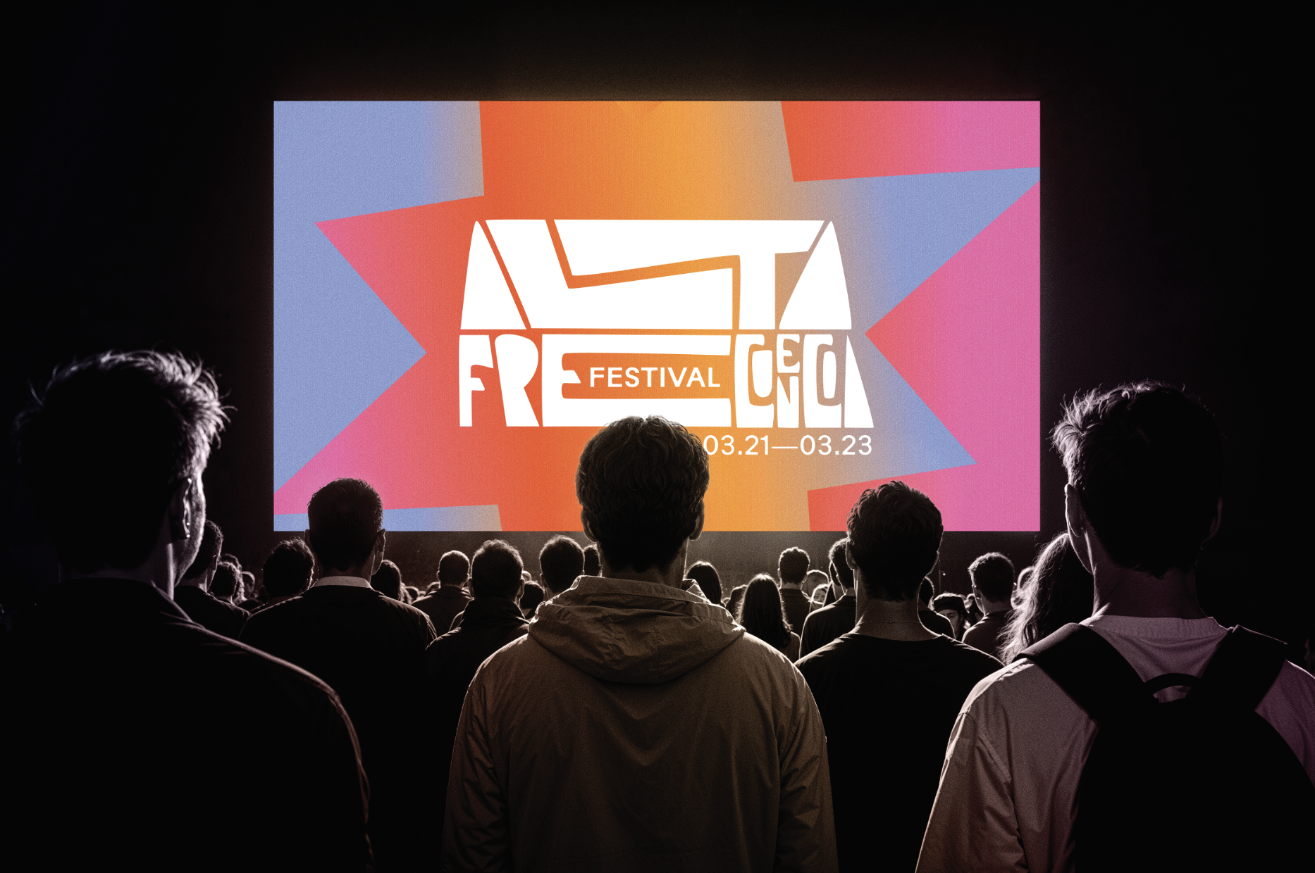
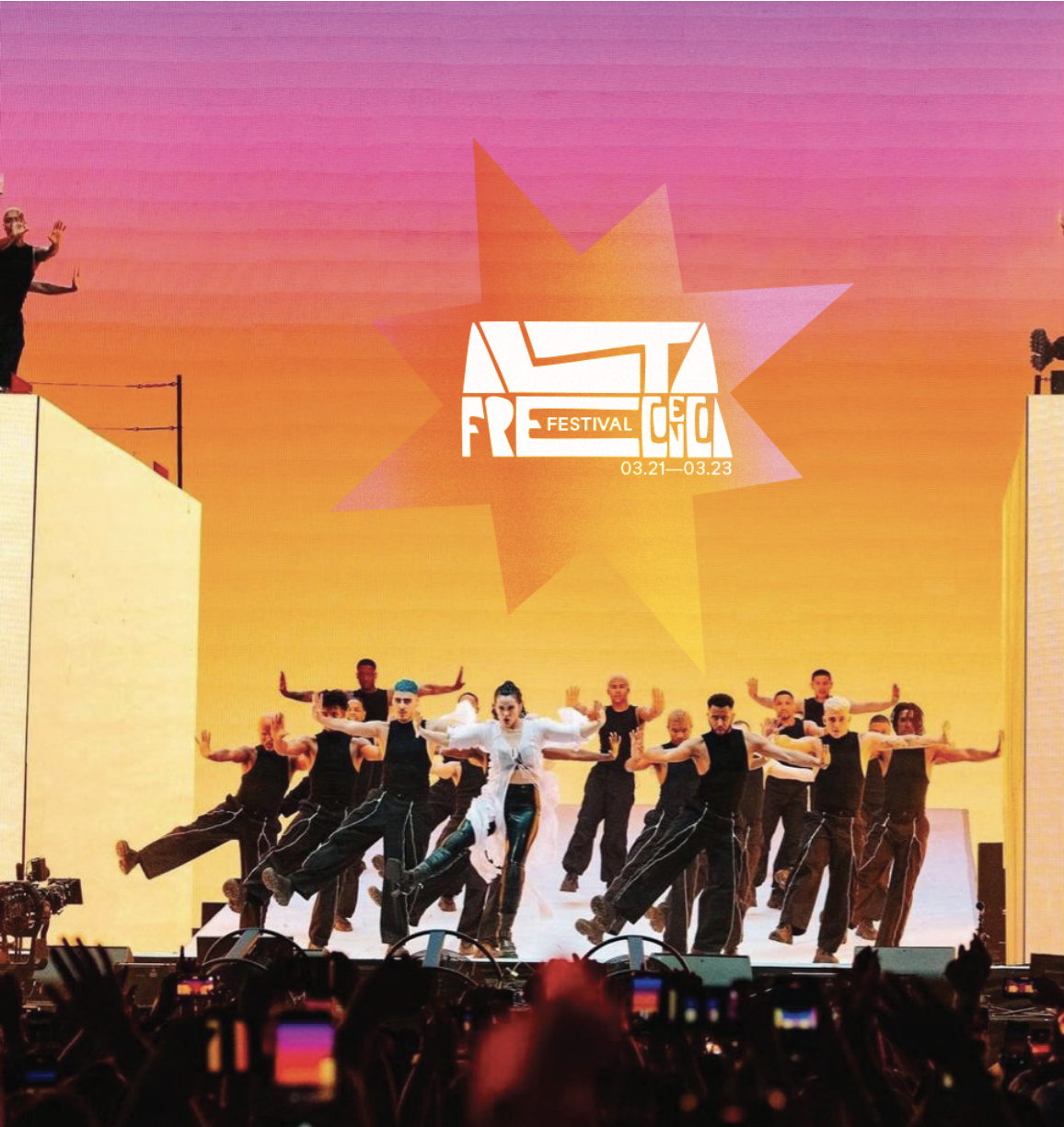
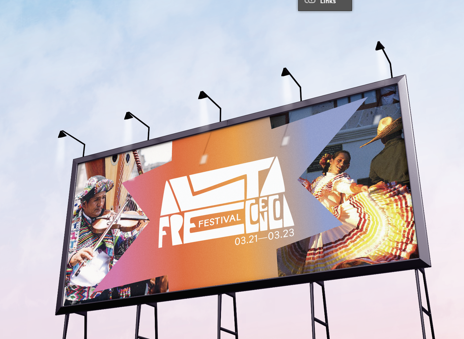
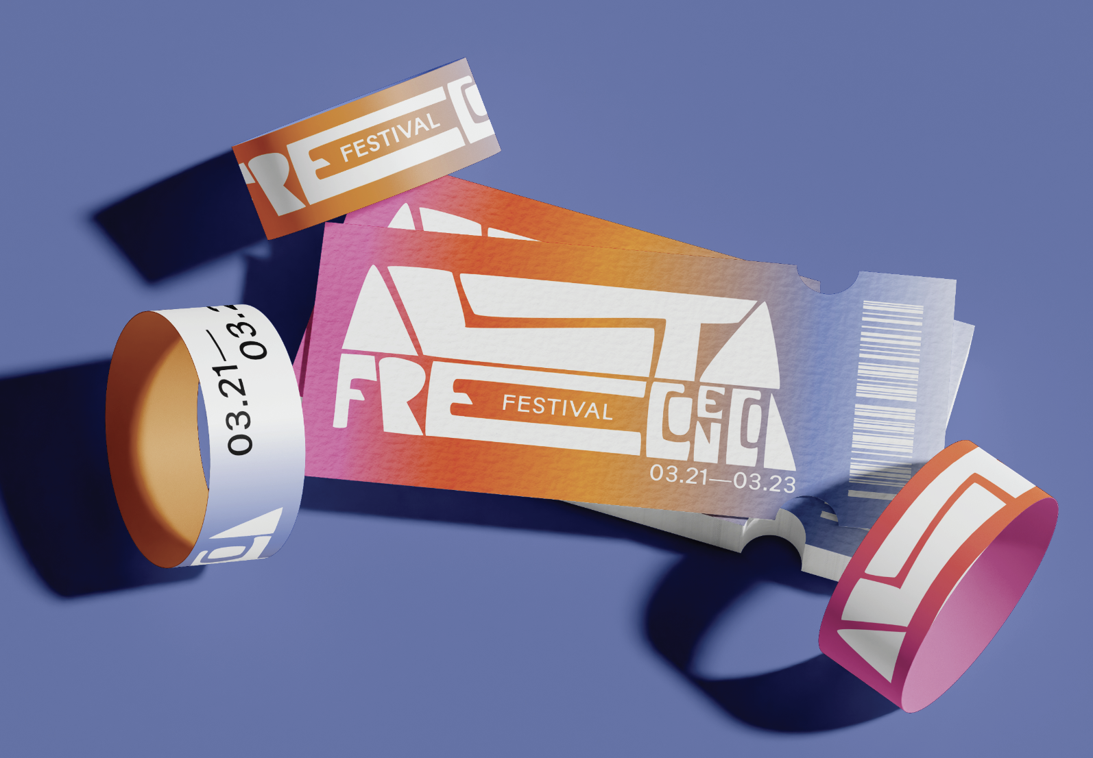
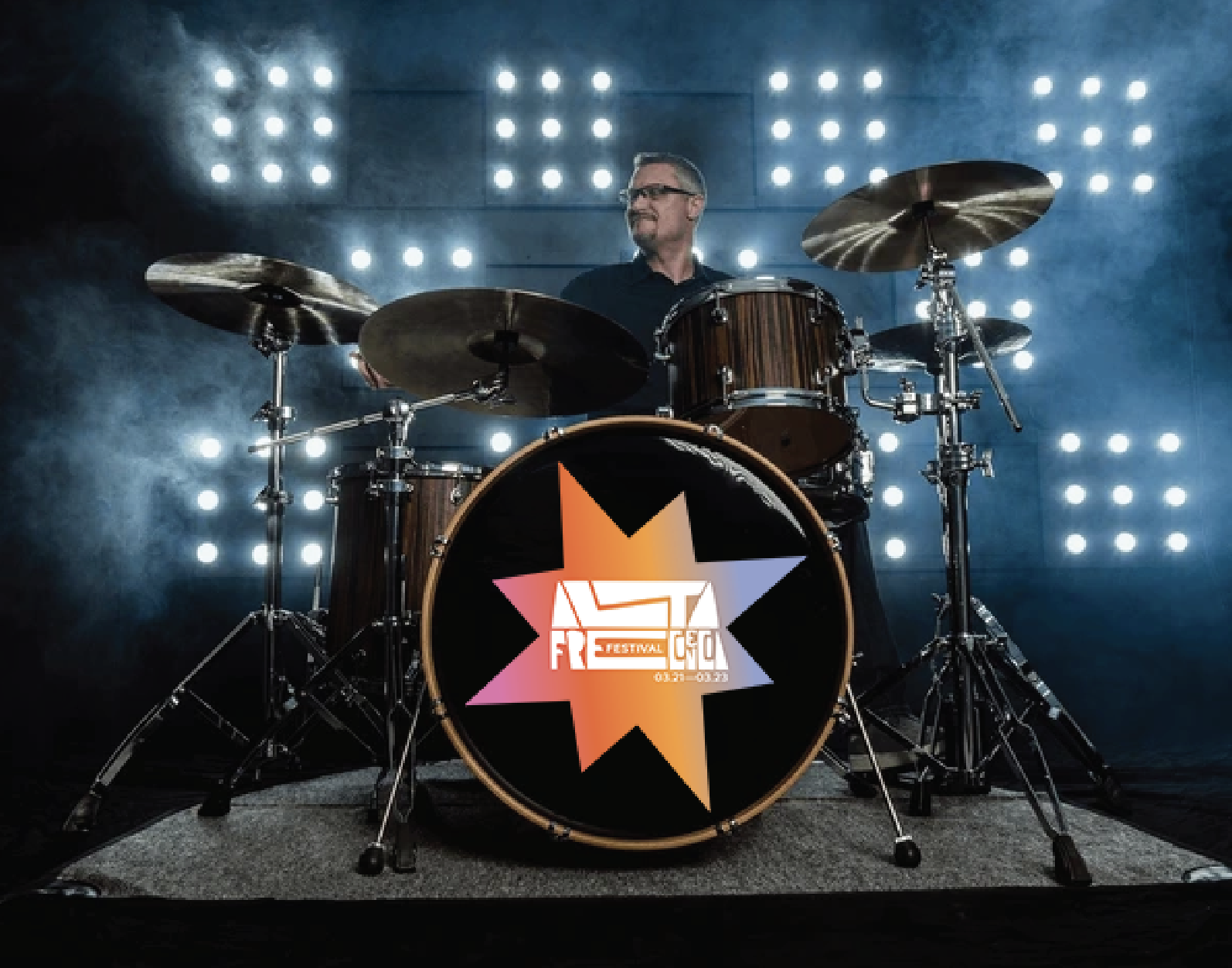
Alta Frecuencia Fest is an annual music festival with only latin music acts. It embraces all types of latin music, from contemporary to culturally traditional, it brings together people of all walks of life to uplift latin voices even when certain people want to mute them. It also has activations throughout the weekend to integrate people into latin usic and sound, from dance workshops to opportunities to play traditional latin instruments.
pROCESS
eARLY RESEARCH & MOODBOARDS
In my early identity design process, mood boarding is crucial for exploring visual languages tied to my topic. I began by researching Latin musicians and their performance aesthetics, noticing the rich patterns in their clothing and instruments. This led me to study South American textiles and how these motifs appear in modern graphic design. I also drew inspiration from Latin typography, illustration, and design.
iDEATION
In this particular project we were pushed to create different versions of a possible identity prior to marrying one. I took 3 unique approaches: One focused on type, the one focused on image, and the third focused on the combination of the two. You can see my explorations and thought process behind each here.
I explored alot of sketching making hand-made type, and this specific exploration really stood out to me due to its dynamic nature. The stretching and retracting motion felt playful and had movement, which I felt spoke to the rhythmic nature of latin music very well. As a system itself, it also just felt very versatile and easy to apply to an array of different medias.
I found this typeface by Madeline ODonoghue and it spoke perfectly to early latin graphic design with cut out typography that was graphically unique. I decided to pair it with cut out shapes that the same language as the typeface. I really enjoy the atmosphere this system creates and it was a close second.
I wanted to play with these flower shapes as a more graphic and digitalized version of flower motifs seen in latin textiles. I enjoyed the layered quality of them and applying the motif to all the different medias. However, ultimately I felt this system worked the least as it felt the most dull and motionless in comparison to the other two.


