Visual Pleasure & Narrative Cinema
This feminist essay by Laura Mulvey identifies and critiques the use of male gaze in film. I created a book using only type to reflect this text through intentional typographic design choices. My intention was to create a modern design interpretation of this historic text, and making it more digestable to new readers. Inside, top, and bottom margins are unconventionally tight, allowing for the bold sans serif body text to make a statement on the page. While the outside margin leaves a lot of white space, primarily to allow for pull quotes to stand out but also allow for readers to annotate this complex academic text.


Typography

Louise

Le Murmure
I chose Louise and Le Murmure as my title, heading, and number fonts because they were subtle and readable display fonts. I feel the sharpness of Le Murmure speaks to the context and seriousness of the reading while Louise’s calligraphic nature complimented and balanced it out.
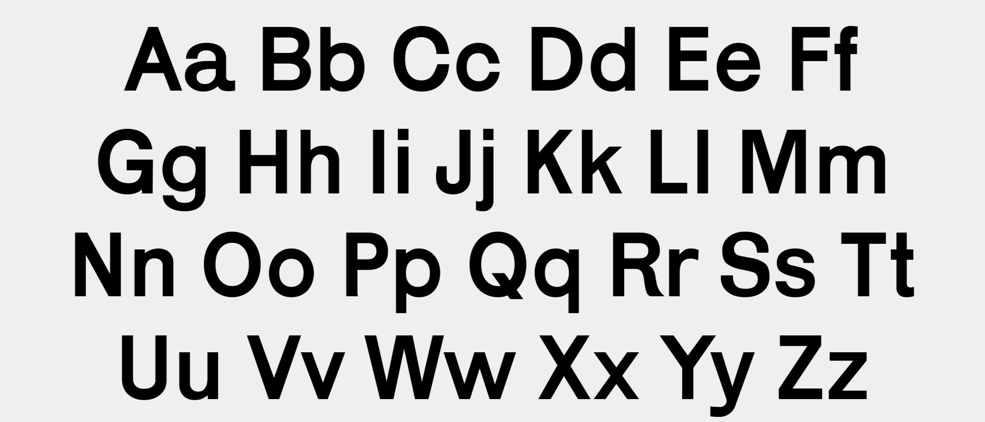
Karrik
The body text is Karrik. I wanted to use a sans serif to represent the modernity of the text and I felt this specific one felt clean and bold which I enjoyed and fit nicely for this project. The overall color of the type on the page had a strong presence.

Experimentation
Experimenting with format, typography, and output style is a vital part of my process. I often got through atleast 3-5 sketches before arriving at my final output. Here I play with book covers, formatting text, page size, and page orientation. I ultimately chose the small 4.25 x 6.87 inch book to make it compact for easy travel.